Category

Flooring

Small budget big ideas!

By Colours, Flooring, Furniture, Good ideas, Interior styles, Kitchen, Lighting, My work, Patterns, Plants, Wallpaper No Comments

We all have big ideas when we want to renovate but it’s the tight budget that cuts the dreams down.

Creativity is key to renovation problems! It may just solve all your problems to achieve your dreams, even though you may have a tight budget.  Through good planning, creative problem solving and a well-trained interior designers eyes (which may down the road save you from horrible costly mistakes as well) can look at a challenged area and create it into something more fun and functional to be in and work from. And we all know that a practical and functional space just makes life so much more easy and enjoyable. Am I right?!

I find the tighter the budget the more creative we have to be.

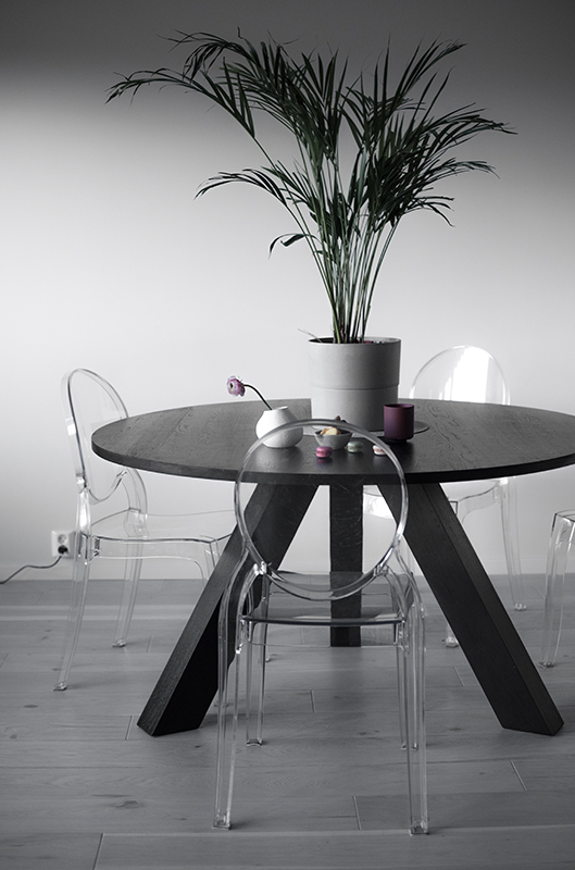
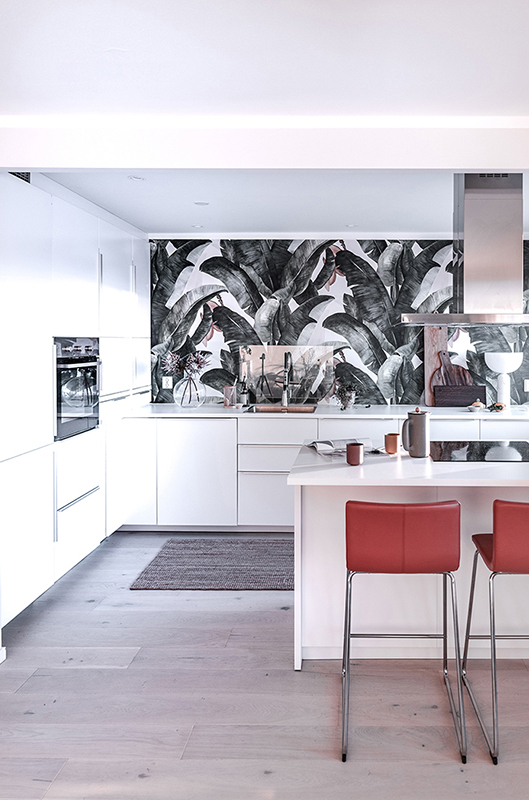
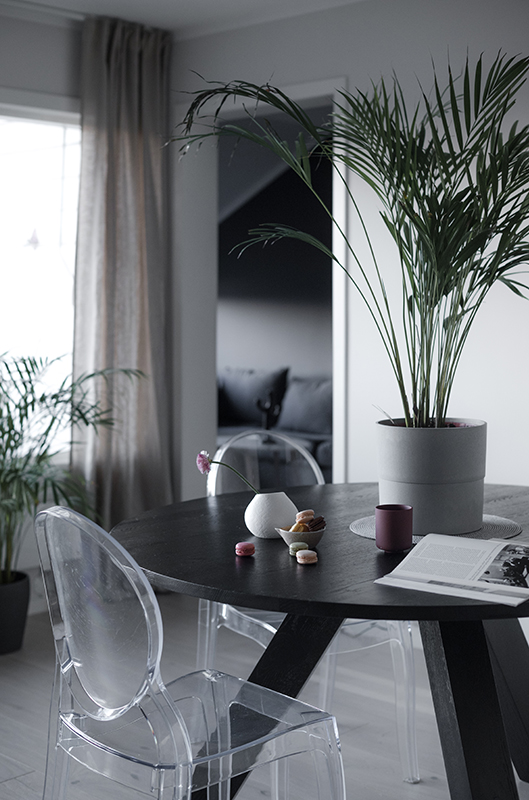
This latest project RoomDesign has been working on involved space planning for several rooms in this apartment, re-inventing the kitchen and dining area, material choices, soft furnishings, lighting and colour scheme. The client did have a tight budget and wanted to prioritize a new plan for her small kitchen area that before had direct access into the bathroom!

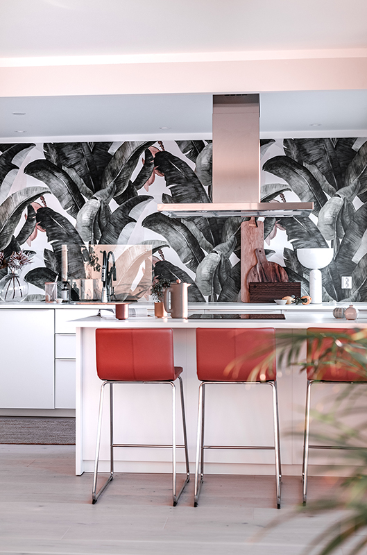
She as well wanted a space with personality and something that packed a punch. Well we did that didn’t we? The wallpaper!

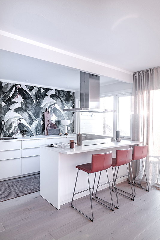
By moving the door to another area and taking away the wall between the dining room and kitchen, it gave better opportunity for a floor to ceiling storage cupboard and made a more inviting social space. The kitchen comes from Ikea and with great help from a super clever builder he helped us build the intricate cupboards and draws to maksimize every centimentre of the wall. The client loves this area and spends the whole time here.

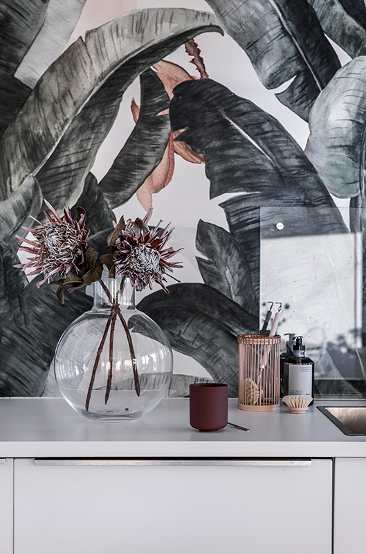
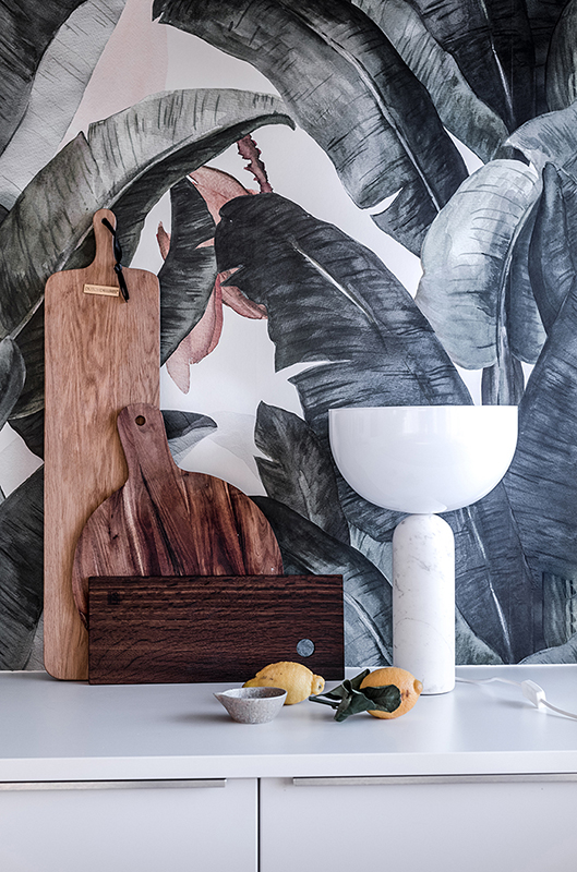
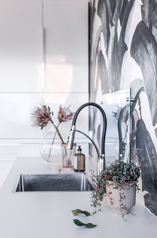
And don’t you just love the wallpaper?! Its called Botany Banana designed from Lemon in South Africa and can be found via Photowall.no
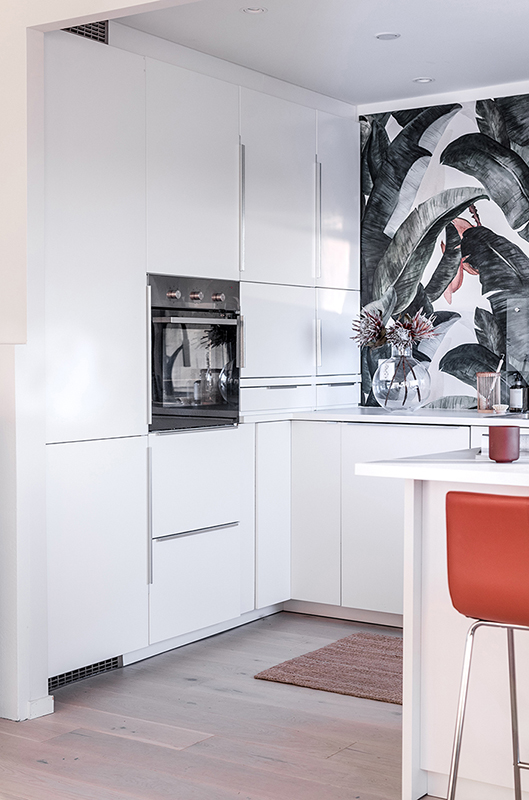
PalmekjøkkenPalmekjøkkenPalmekjøkkenPalmekjøkkenPalmekjøkkenPalmekjøkkenPalmekjøkkenPalmekjøkkenPalmekjøkken

Pic credits Gunn K Monsen

Making the most of a Small Bathroom

By Bathroom, Black, Colours, Flooring, Good ideas, Lighting, Mirror, My work No Comments

“We are a busy family of 5 in need of help with reorganizing of Storage space, new space planning and modernizing of our existing bathroom. High in the wish list is a bathtub to wash our big sized dog after trips in the woods.”

Conquering small bathrooms can be challenge when lacking in storage, organization and in need of modernizing. The clients were open to something different, not the normal white, to clever spacing planning and have good storage possibilities which was all very important for the active family.

We decided to take away a little bit of the entranceway creating a possibility for a shower nook in the bathroom without sacrificing the otherwise small floor area in the bathroom.

The wall between the bathroom and a little laundry room was removed. We added sliding wardrobe doors in black glass to reflect light and create a more spacious feel.

We were lucky that the window could be moved enabling better placing of vanity and mirror cabinet.

The clients loved the idea of darker walls and lighter floors. This gave the bathroom depth and created a unique feeling to the room.

Maximizing space and cleaning up all clutter with a mirror cabinet, matching wall storage cabinet and vanity just gave the extra practical edge to the room. By opening the bathroom more made the bathroom more spacious visually. The oval free-standing bathtub become the hero, or focus point of the room which the clients loved! With the darker walls good lighting was necessary under and over the mirror cabinet.

All it takes is just a few simple changes to the whole space planning of the bathroom area and the family functions much better. This adding value to their life and the whole apartment.

We like that!

RoomDesign Bad-4RoomDesign Bad-5RoomDesign Bad-11RoomDesign Bad-12RoomDesign Bad-13RoomDesign Bad-15-1RoomDesign Bad-15RoomDesign Bad-16-1RoomDesign Bad-17RoomDesign Bad-19-1All photos gunnkristinmonsen.no

RoomDesign has had the privilege of working on this prosject giving advice on the spaceplanning,  furniture, tiles, lighting and colourscheme.

Thanks to the fabulous family in Nesttun that allowed me to help them on their renovation travels!!<3<3

Hugs Lisa xx


New look – stylish and super functional

By Colours, Fireplaces, Flooring, Good ideas, Kitchen, Lighting, Livingroom, My work No Comments

«We want a home that is stylish and that is super practical and functional to our needs»

There was a definite need for an overhaul in this townhouse in Nesttun. There were two small living and dining rooms, dark and cold stairway and kitchen needed to be more functional and updated for a busy family of five. The man of the house is totally passionate and serious about his fireplace! Here had to be a fireplace that would warm up the house appropriately, stylish and cool to look at and have extra storage to firewood. Where the beam in the ceiling is today in the living and dining area was once where a wall was between the two rooms.

The entranceway and stairwell got a new look by removing the classic two door opening from the stairway into the living area. Rather than a closed-in stairwell being cold and dark, it was decided to remove the doors and open up the whole stairwell facing into the living and dining areas. A sliding glass door was put between the stairwell and entre, creating a more open stairwell connecting more with the living area, spreading more warmth up to the other floors and giving a more modern and functional living area.

A new window, the same size as the others, was put on the side of the house near the corner of the dining area and this allowed for more light and better connection to the terrace outside.

I must say I’m so in love with the kitchen! Its so cool and stylish, loads of storage, all that work space for baking and the little extra sitting area. The white benchtop was suggested to continue down to the floor which frames in the sitting area and adding extra style and finish. The subways tiles over the benchtop to the ceiling just gives a little extra wow factor.  Don’t you love it?

roomdesign-3roomdesign-5roomdesign-6roomdesign-15roomdesign-10roomdesign-16roomdesign-23

All fotos : gunnkristinmonsen.com

RoomDesign has had the privilege of working on this prosject giving advice on the spaceplanning, design for fireplace, kitchen and in-built storage for television, furniture, flooring, lighting and colourscheme.

Thanks to the rocka family in Nesttun that allowed me to help them on their renovation travels!!<3<3

Hugs Lisa xx


5 Benefits to using rugs in your home

By Colours, Flooring, Furniture, Good ideas, Happenings, Livingroom, My work, Patterns, Rugs, Tricks No Comments

Having rugs in your home can make a enormous difference to the appearance, personality and style for your home. Those who never thought of keeping rugs in their house cannot realize the importance, elegance and difference in the overall living and impression that it will make.

blogg-bildepic credit Pinterest

There are many benefits of rugs and I have gathered just 5 of many…

#1. Creates an instant and perfect focal point of colour for your room.

#2. Rugs act as a shield for your hardwood floors. They protect the floor from all kinds of stains and scratches.

#3. They  help to absorb loud noise of radio and TV, as compared to a room with hard surfaces.

#4. Rugs are made up of many different materials that will keep your house warm, thus saving your heating expenses.

#5. One fun thing to do is it can be hanged on the wall. Cool idea, no?

Have a good day all:-)

Hugs og love xx

Cabin by the sea

By Bathroom, Bedroom, Colours, Flooring, Furniture, My work, Rugs, Wood One Comment

Rita and Arvid tok kontakt with me over a year ago. They owned a little cabin by the sea that needed a makeover. It was already quite old, outdated and because of its location and sentimental value they wanted to start using it with their own family til the sommer months.

Consideration to regulations of houses being so close to the sea, these days,  there was not much allowance for building out. In any direction! There was, though, allowed to build out the small terrasse by the kitchen. Here was placed glass sliding doors to bring the beautiful views and nature outside in.  Cladding out side the house was updated and modernized and at the same time a new terrasse was made at the entrance door. Inside walls were taken away between the kitchen and living room. The bathroom was made slightly bigger by building a little shower nook into the guestroom! Maksimalising the little space there was and a super good idea! There was made plenty of space for the garderobe in the guest room and walk-in garderobe in the main bedroom giving loads of room for extra storage. A window was suggested at the end of the hall in the entranceway adding extra light and giving extra depth to the hallway.

Take a look at all the pic’s under and get inspirert!

RoomDesign has come with advice, suggestions, ideas and space planning to the inside and outside, colours, kitchen design, bathroom design, furniture and lighting.

hytte kjøkken 01hytte kjøkken 02P1030443hytte kjøkken 04hytte kjøkken 05

Badet.

badet hytte 01badet hytte 02badet hytte03

Gangen

gangen 01gangen 02gangen 03

Stuen

stuen 02stuen 03stuen 04stuen 05stuenkjøkken stuenuteuteute

Thanks to Rita and Arvid for letting me help them with the renovations to their cabin by the sea.

Hugs xx.


Moving furniture away from walls

By Flooring, Furniture, Good ideas, Kategori, Livingroom 3 Comments

Moving furniture away from the walls in your living room breaks up the linear aspects in your room.  It gives more depth to the room; by showing more of the floor makes the room instantly bigger, more airy and far less boring! It can be as simple as angling a chair or table slightly too just add a little interest to a room and away from the boring mundane linear lines of a square room! Who knows by moving your furniture a little you might discover a whole new look to your space!!

living room

Pic via Designsponge


Have a great day everyone!

-Hugs Lisa


If it makes you happy…

By Flooring, Furniture, Livingroom, Wallpaper No Comments


Today I have to share a picture with you.

It just makes me want to smile.

Those cranes legs under the coffee table are just so gorgeous. It fills me with love that the bird pictures are scattered over the whole wall.     Now I’m sure a lot of interior designers out there would just shake their heads in disbelief.  But the colours in the room harmonize nicely, the rustic flooring grounds the room beautifully with the modern sofa and the old style wallpaper. So why not make a little wacky in-balance to tantalize the eye and make the room fun!

So if it makes you happy why not!


Pic via desiretoinspire


Happy friday everyone:-)


Love Lisa


Sneak peek…

By Bedroom, Colours, Flooring, My work, Patterns One Comment

Painting walls and ceilings dark has to be the most fantastic experience in interior I have come across. It may not be for everyone but if you should just try a room you will be amazed at why you haven’t done it before. And by no means did the room look any smaller in fact I felt the room expanded out not in. When one uses dark colour on the walls and ceilings and floors remember shots of colour and enough lighting are essential to create a right balance in the room.

These pictures are just a little detail preview to my daughter’s bedroom. More pictures of the whole room will come later.


Love love love

Lisa

Rugs again…making a statement!

By Flooring, Interior styles No Comments

I love rugs! And rugs will lift and rescue any room in the house from a boring dull interior. The key is adding an unexpected texture to the room. And why not add a rug whether it is a floral, or floss, geometric or of a different texture. Let it be wild, pump it up! Try it?…

For more pictures and rug inspiration check out The Rug Company here…


Have an inspirational day everyone:)


Love Lisa